Visualizing Inter-Rater Reliability
Background on Reporting Inter-rater Reliability
Qualitative studies often report inter-reliability (IRR) scores as a measure of the trustworthiness of coding, or an assurance to readers that they might follow the researcher’s codebook and expect to find similar results. How these scores get reported varies widely. Often, I see just the range of scores reported, hopefully with Cohen’s kappa calculated in addition to the more straightforward percent agreement. The kappa is important because it takes into account variance in the frequency of a code. For example, pecent agreement may be 97%, but if a code is used infrequently, kappa may be very low, even 0. Reporting kappa scores assures readers that in the instances when a rare code is used, the codebook is clear enough that a second coder will catch it.
Of course, the whole qualitative coding process can be tricky, and in many cases, researchers must go through multiple rounds of dual coding a sample, revising the codebook, and coding a new sample. All of this nuance tends to get lost when researchers write their Method section, no doubt because this is an easy place to cut words to satisfy the requirements of a journal article.
Reflecting on this whole process, I wanted to come up with a way to demonstrate the progress made through multiple rounds of dual coding for IRR. I came up with the plot displayed below for my dissertation study, which required five rounds of dual coding. Still, through this process, the IRR scores converged nicely in the fifth and final round. I’m pleased with this results as well as how this data visualization turned out.
Visualization: Inter-rater Reliability Scores Plotted Across Five Rounds of Dual Coding
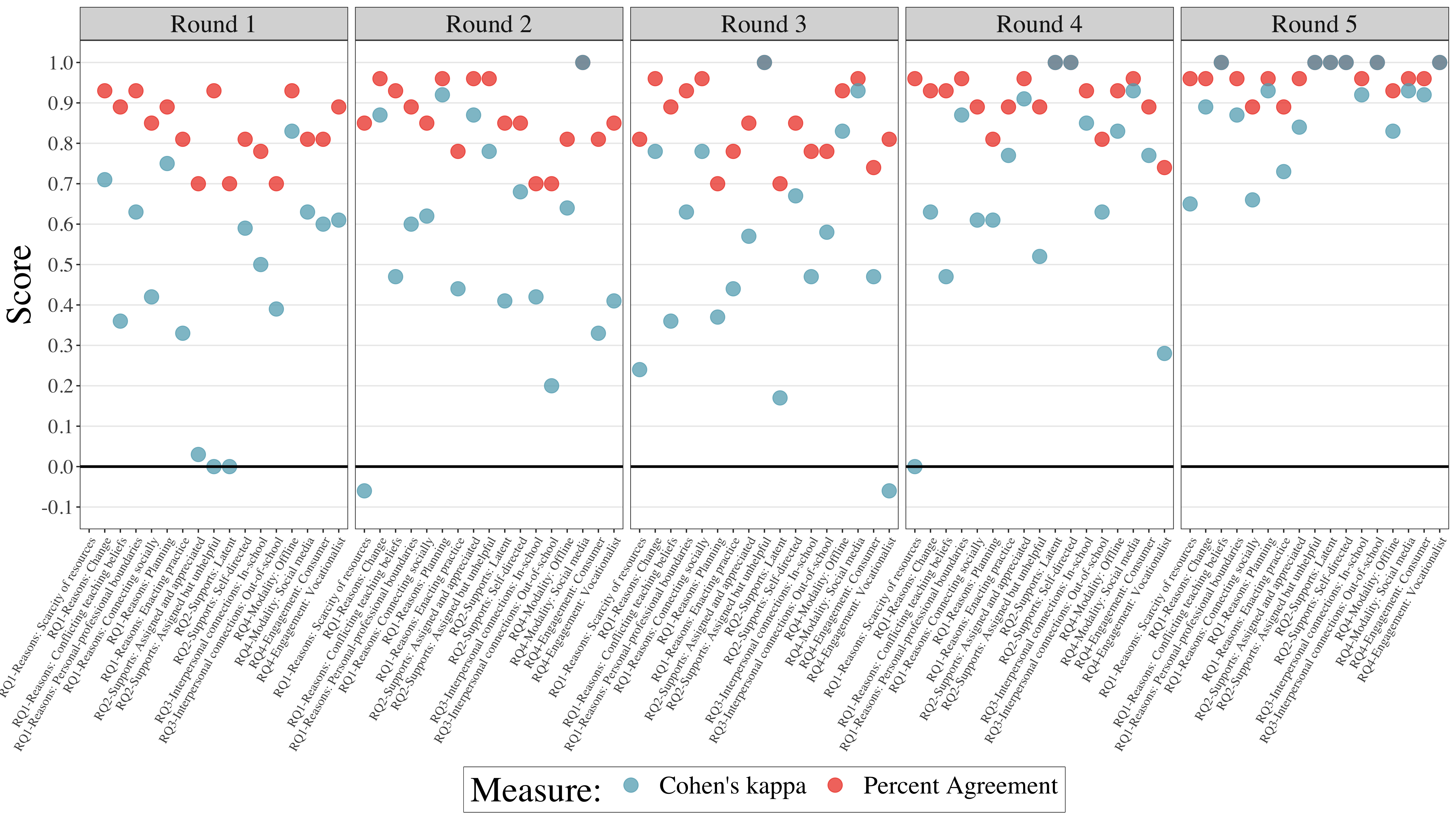
Note. In my research, I follow a rule of thumb where two independent coders apply the codebook to 10% of the corpus in distinct rounds of coding until percent agreement on all codes is above 0.80 (i.e., 80%) and Cohen’s kappa for all codes is above 0.60.