Dissertation Themes
As I’ve wrapped up numerous cycles of qualitative coding of interview data for my dissertation, Into the edu-verse: New teachers seeking induction support on social media, I used geom_tile() in {ggplot2} to create heatmap plots to help me quickly visualize how thematic codes varied by interview participant.
Heatmap Comparison of Thematic Codes by Interview Participant
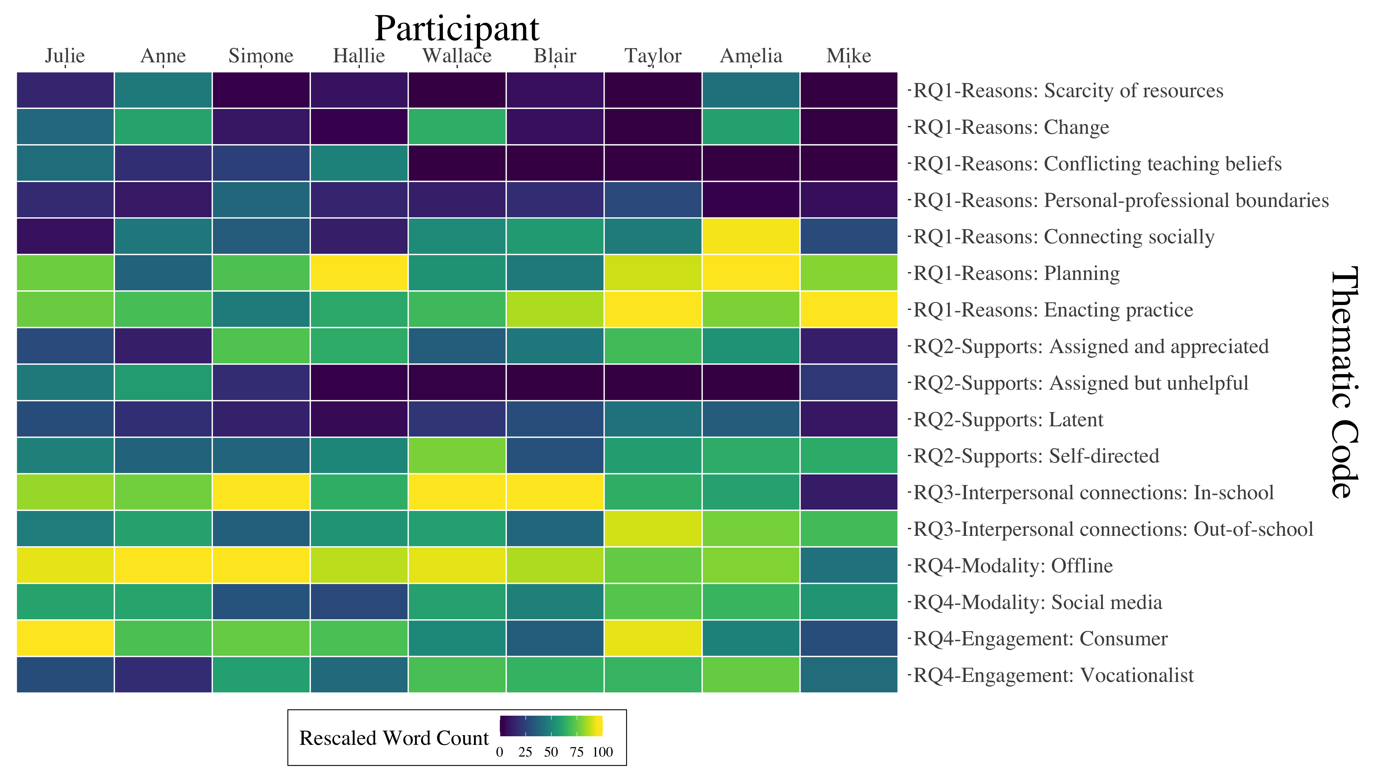
Note. Columns have been computationally reordered using principle components analysis (PCA) so that side-by-side columns are more similar than non-adjacent columns. Tile shading represents the number of words a participant spent speaking about a topic relative to how much they discussed other topics, rescaled to 0-100 for comparison between participants.
I’ve shared the code to produce these plots in a GitHub repository, and you can also view on RPubs a variety of different heatmaps I created en route to these final plots.