Comparisons in Twitter #Edchat During COVID-19
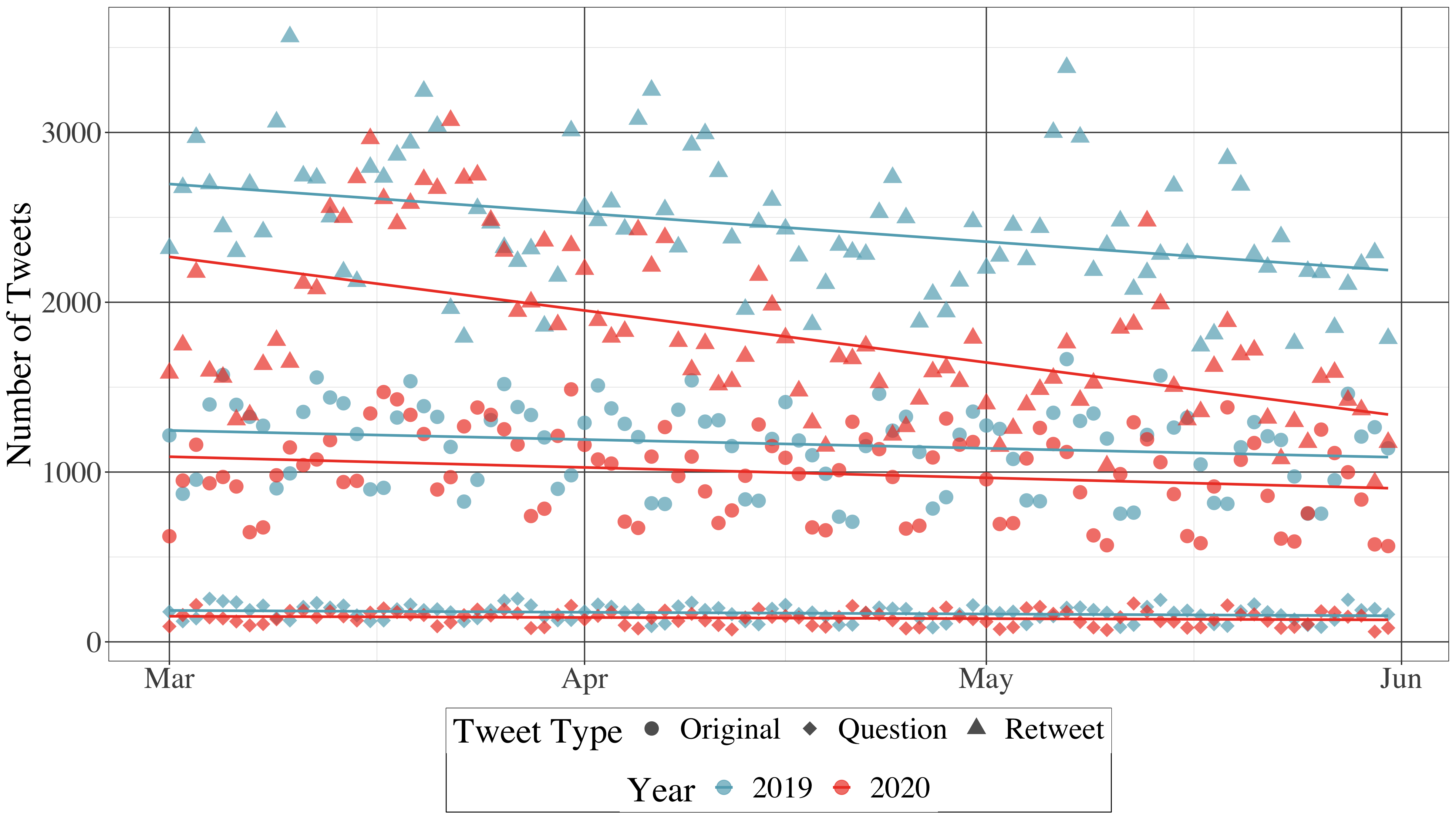
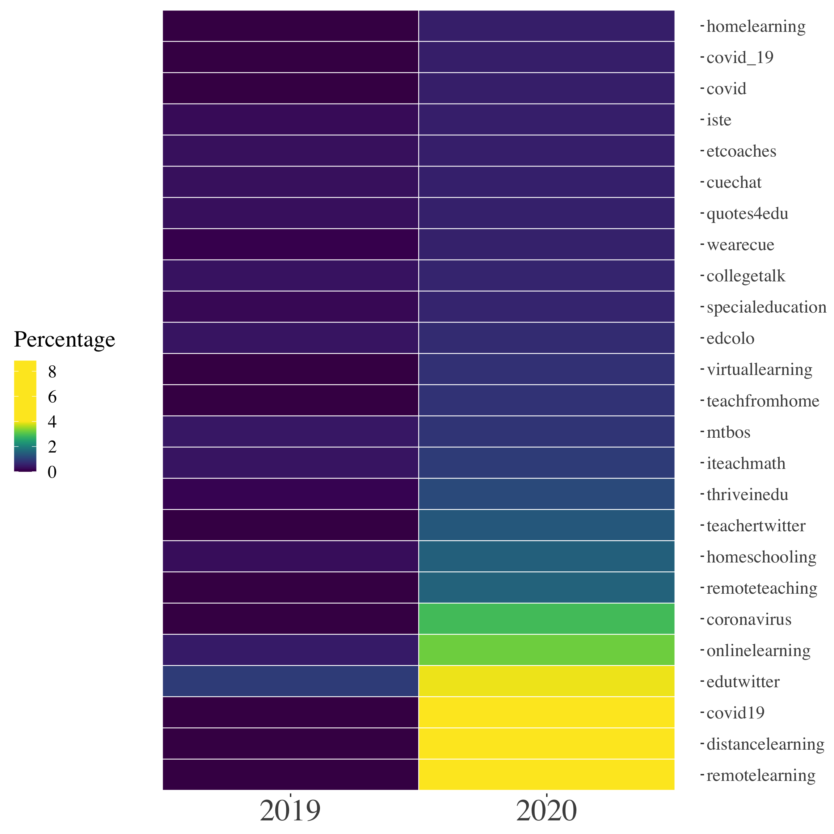
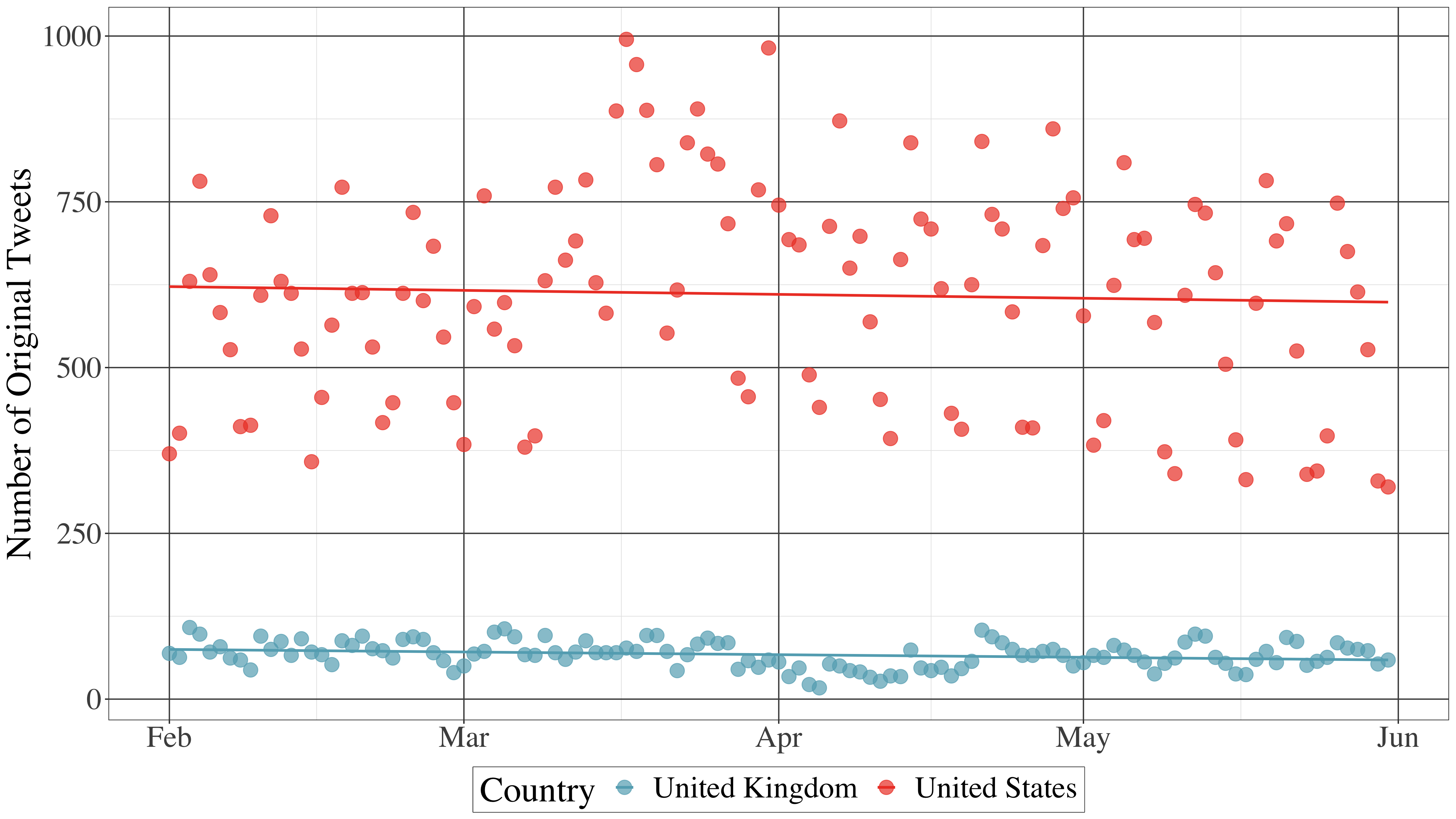
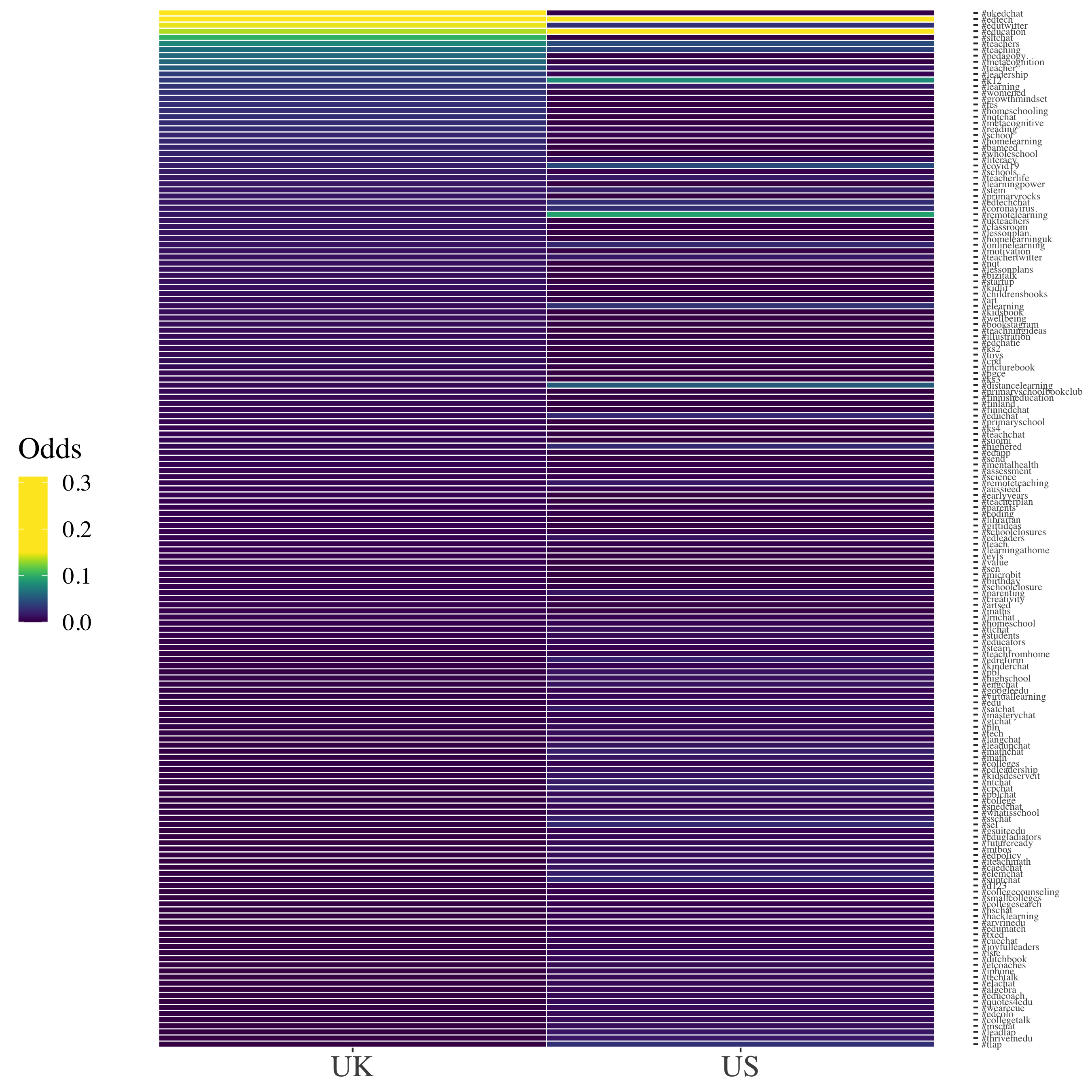
I am in the midst of two projects looking at how Twitter #Edchat tweets may have been affected by the COVID-19 pandemic. The first project is primarily comparing tweets in Spring 2020 to those in the same timeframe a year earlier. The second project focuses on Spring 2020 but compares tweets from U.K. and U.S. users. I used geom_tile() in {ggplot2} to create heatmap plots to help me quickly visualize and compare a large number of data points.
#Edchat: Comparing 2019 to 2020
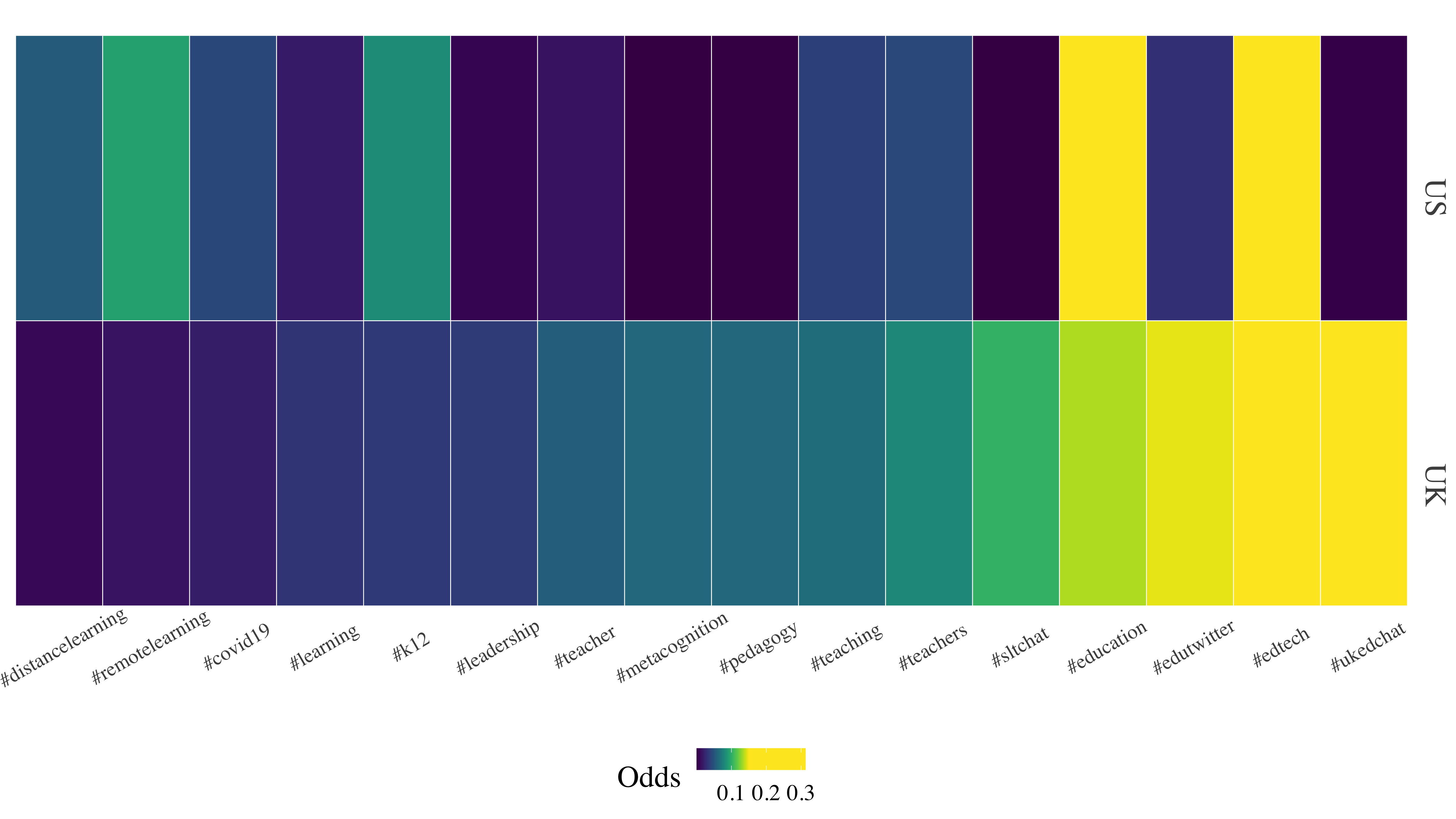
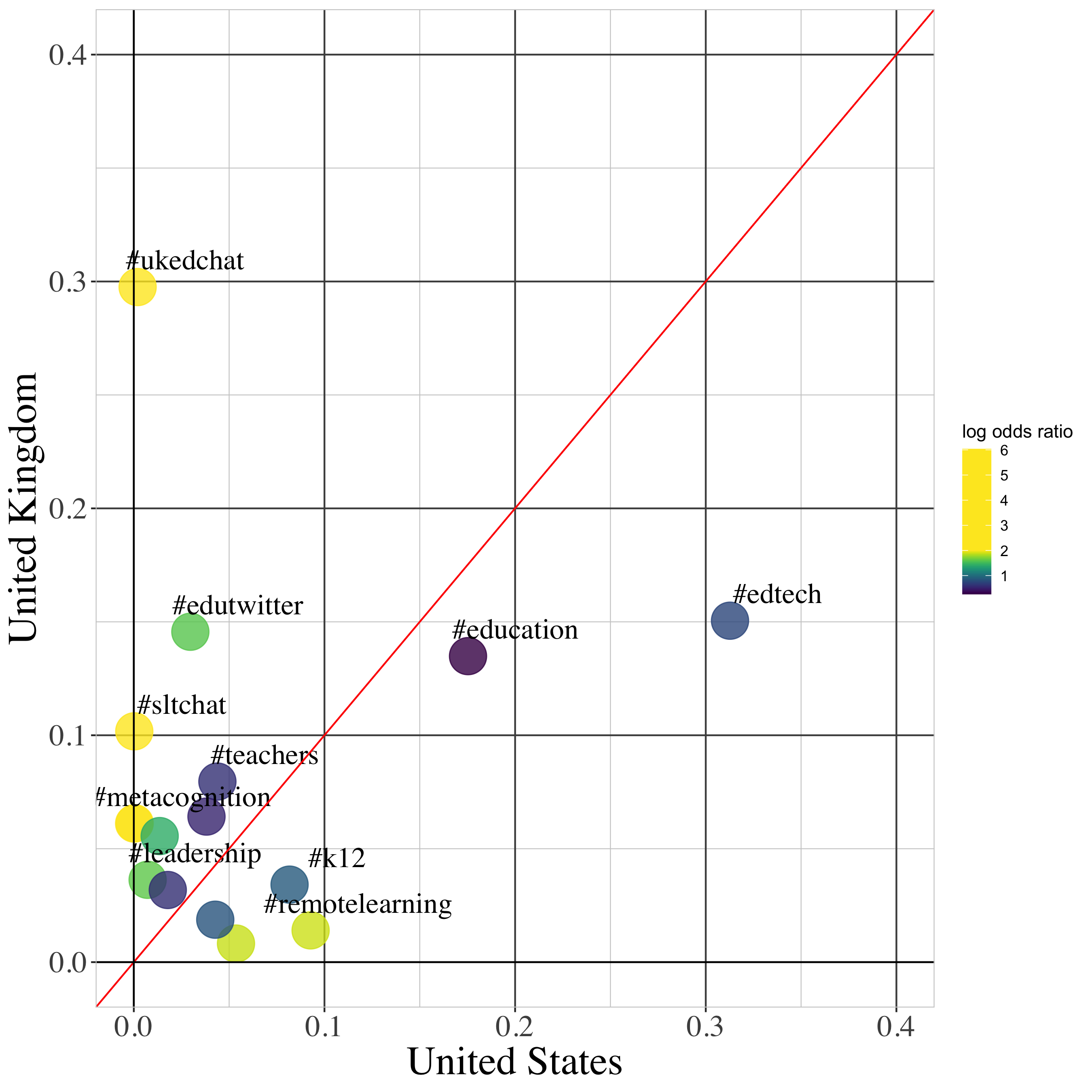
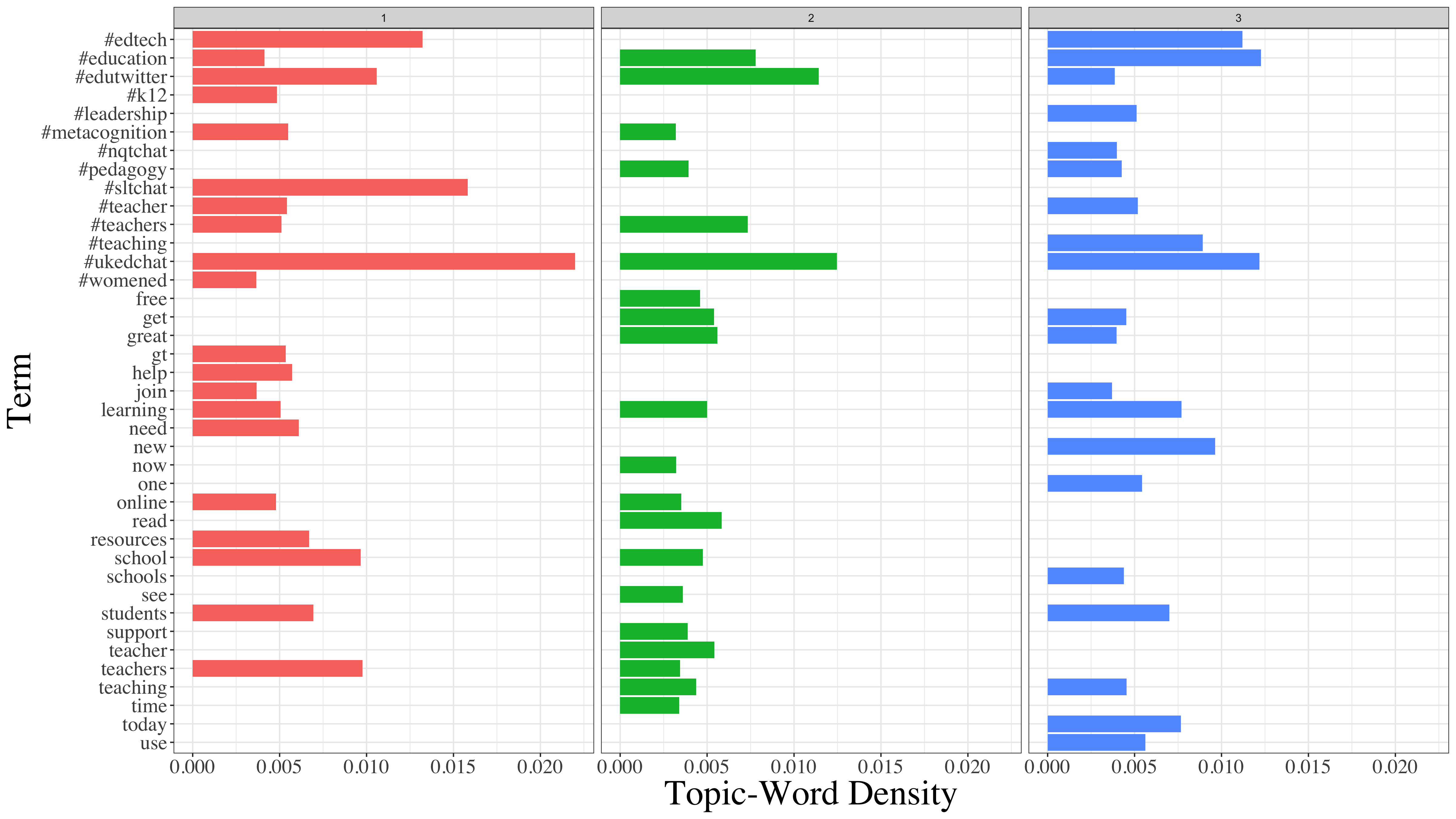
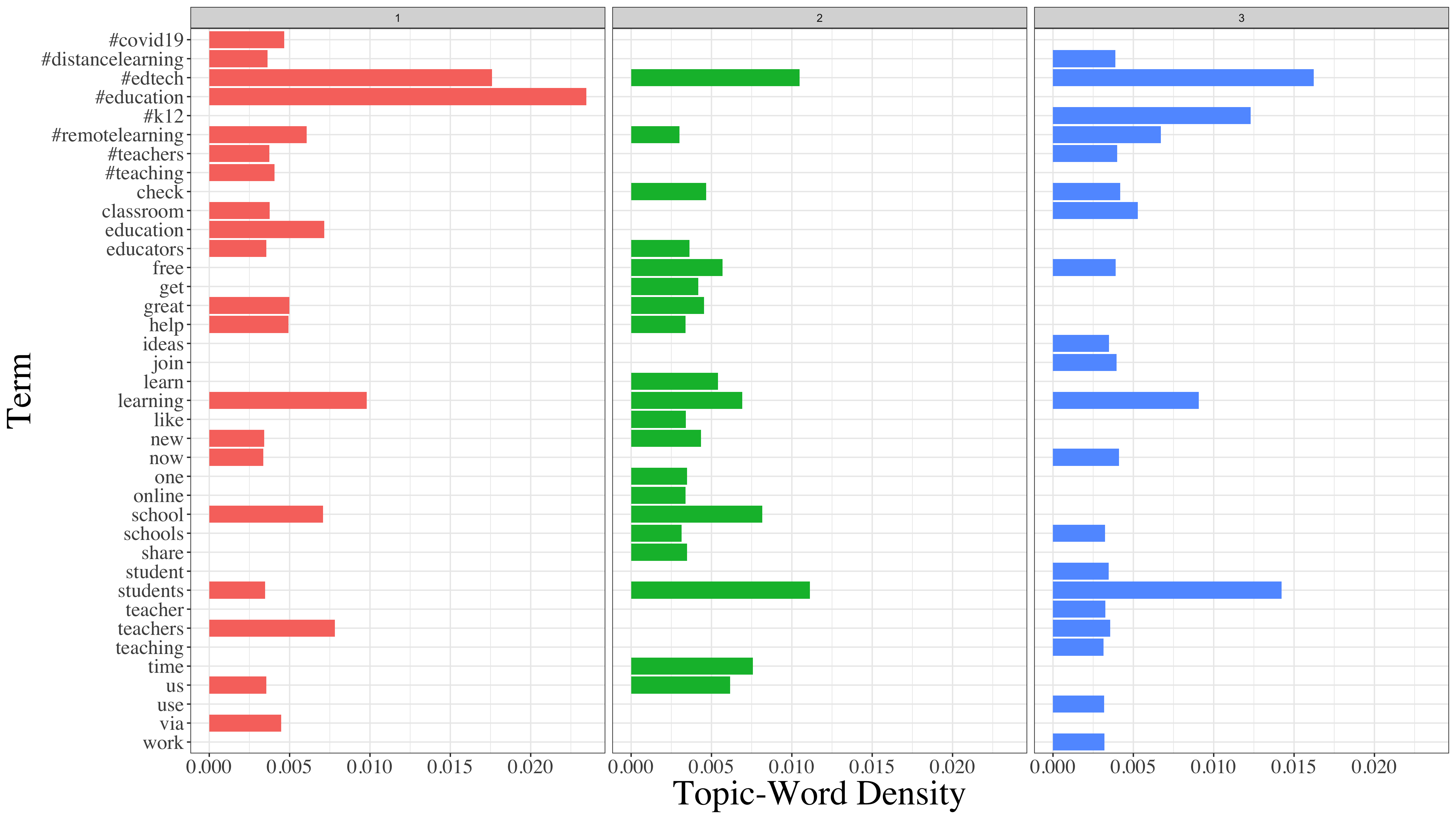
#Edchat: Comparing U.K. to U.S. tweeters
Top 100 hashtags comparison
Top 16 hashtags comparison
Topic models comparison (3 topics per country)
You can view all the output from these projects on RPubs, both the 2019 vs. 2020 project and the UK vs. US project.